
This article contains affiliate links. For details, see the disclosure.
PEEL-AND-STICK WALLPAPER
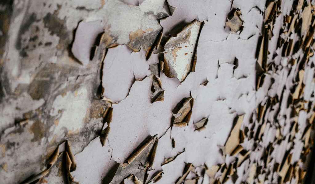
The simplicity and broad range of patterns offered by peel-and-stick wallpaper propelled its rapid rise in popularity. Yet many buyers soon recognize drawbacks. Within a year, the edges may start to lift, the patterns can fade, and humidity can cause bubbles or warping. What initially seemed like a quick fashion shortcut often proves fleeting and of lower quality. Moreover, removing certain varieties can even damage the wall. While it works well for short-term use or rental spaces, peel-and-stick wallpaper often fails to maintain a polished appearance over time.
FAUX MARBLE CONTACT PAPER
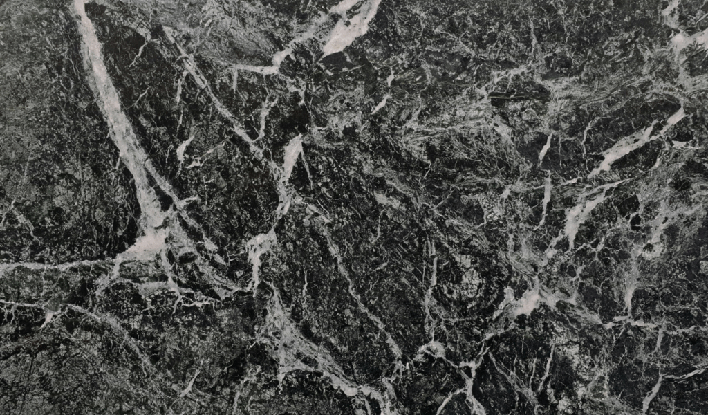
Applying faux marble contact paper to countertops or furniture is a budget-friendly attempt to achieve a luxe look without the expense. Over months, corners tend to tear, and the glossy plastic surface can scuff, stain, or lose its original sheen. What began as a stylish Instagram-worthy hack often reveals itself as a cheap fix rather than a durable design choice. Many buyers become unhappy when the material starts resembling stickered plastic more than real stone, especially in kitchens and bathrooms.
MATCHING FURNITURE SETS
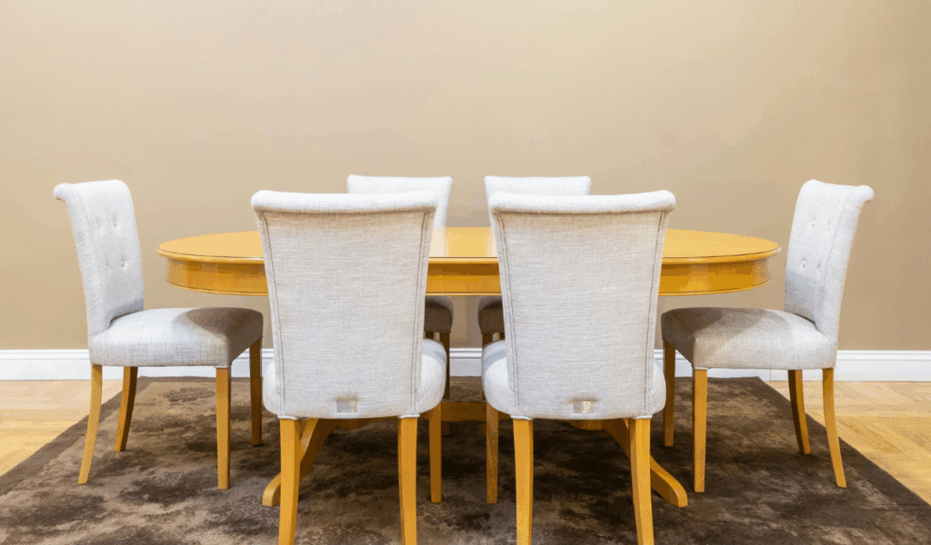
Fully coordinated sets can appear in showrooms, giving the impression of an easy win for organizing a space. In reality, many homeowners feel these sets don’t age well and can seem uninspired. Matching every piece—from the sofa to the coffee table and end tables—can read as overly staged and cookie-cutter. After a year, the lack of contrast or texture can feel curated and flat. Today people prefer mixing materials and styles to achieve a more layered, lived-in, and timeless look rather than a showroom vibe.
EXCESSIVE GRAY EVERYTHING
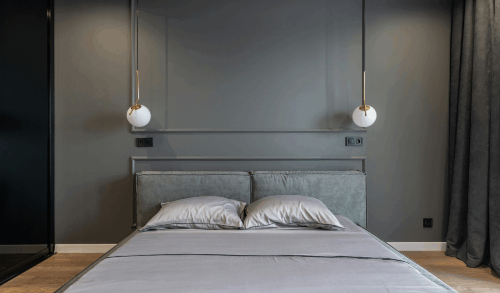
Gray used to be the ideal neutral, but overdoing it can drain a space of energy. If walls, floors, furniture, and decor all lean into varying shades of gray, the room can feel cold and flat. After a year, many spaces feel darker or too sterile. An all-gray scheme can lose its contemporary edge and begin to look worn unless warmth or color is introduced. Balanced use of gray remains effective, but excess dulls the atmosphere over time.
OPEN SHELVING IN KITCHENS
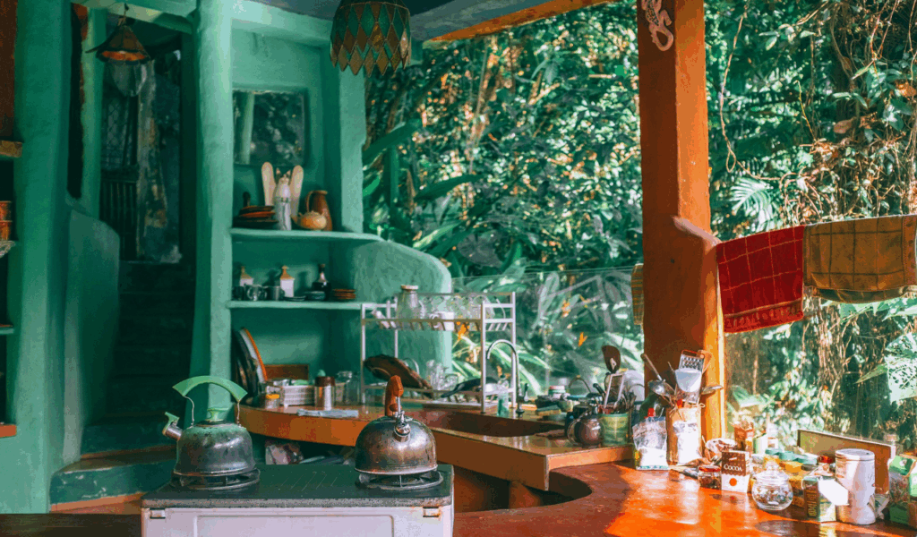
Open shelving can look striking in staged kitchens or on social feeds, but reality often falls short. Over time, dust and cooking oils accumulate on exposed shelves, and without careful styling they can appear cluttered. Maintenance can become burdensome, and after a year, the open layout may feel more chaotic than chic. Many people regret switching from closed cabinets to open storage in the long run, even though it suits minimalist displays and showpieces.
WORD ART WALL DÉCOR
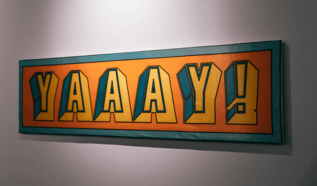
Word art with phrases like “Eat,” “Family,” or “Love” enjoyed a surge of popularity but quickly became overused. While these motifs can feel charming initially, after a year they often look overdone—too literal and mass-produced, lacking personality and depth. More homeowners are choosing original artwork, framed photographs, or textured wall pieces to add authenticity and reduce trend-driven decor.
ALL-WHITE INTERIORS
All-white spaces may seem clean and bright at first, but many owners find them quickly uninviting and dull. Scuffs, fingerprints, and general wear show up easily on high-traffic surfaces. A lack of contrast or texture can cause the space to feel sterile or unfriendly over time. After a year, pieces that once looked magazine-worthy can appear worn and monotonous. Introducing warmth, color, and layered textures helps prevent the sterile, rental-like vibe.