
Bold colors can transform a space, adding vibrancy and personality to your home. However, using them incorrectly can lead to overwhelming or chaotic interiors. By understanding what to avoid, you can achieve a stylish and harmonious look that balances boldness with comfort and sophistication.
Common Pitfalls to Avoid with Bold Colors
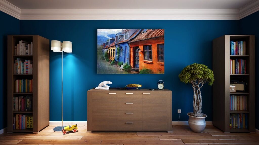
Using Too Many Bold Colors Together
Mixing multiple bold shades in one room can make the space feel cluttered and chaotic. Avoid this by selecting a primary bold color and complementing it with neutral tones or muted accents. This approach ensures a cohesive look without overwhelming the senses.
Ignoring the Size of the Room
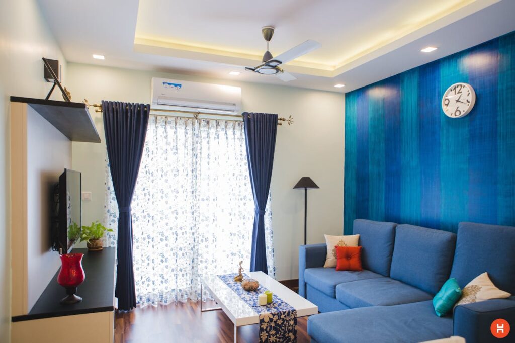
Bold colors can make small spaces feel even smaller if not used strategically. Avoid using dark, vibrant tones on all walls in compact rooms. Instead, incorporate bold hues as accents or feature walls to create depth and prevent a cramped appearance.
Skipping a Color Palette Plan
Diving into bold colors without a clear plan can result in a disjointed design. Avoid this by creating a cohesive color palette that aligns with the mood and style you want to achieve. Consider complementary or analogous color schemes for a balanced effect.
Forgetting About Lighting
Lighting dramatically influences how bold colors appear in a space. Avoid relying solely on natural light or ignoring artificial lighting when planning your color scheme. Test your bold color choices under different lighting conditions to ensure they maintain the desired look throughout the day.
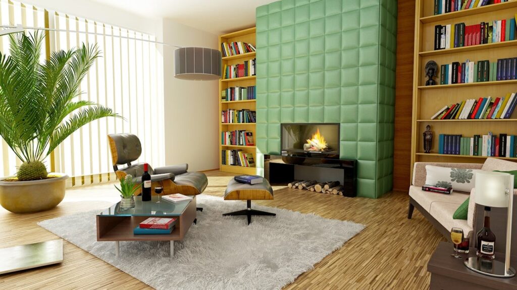
Overloading Bold Furniture and Decor
Filling a room with bold furniture, decor, and wall colors can create visual overload. Avoid this by letting one or two bold elements take center stage, such as a statement sofa or an accent rug. Balance the look with subtle furnishings and accessories.
Tips for Using Bold Colors Effectively
Layer Bold Colors with Textures
Instead of relying solely on color for impact, incorporate textures to add depth and interest. For instance, pair a bold-colored sofa with cushions in varying fabrics like velvet or linen. This adds dimension and prevents the space from feeling flat.
Balance Bold with Neutral Tones
Neutrals such as white, beige, or gray help anchor bold colors, creating a calming balance. For instance, a bold navy wall can be paired with soft white furniture to maintain a harmonious aesthetic.
Use Bold Colors in Accessories
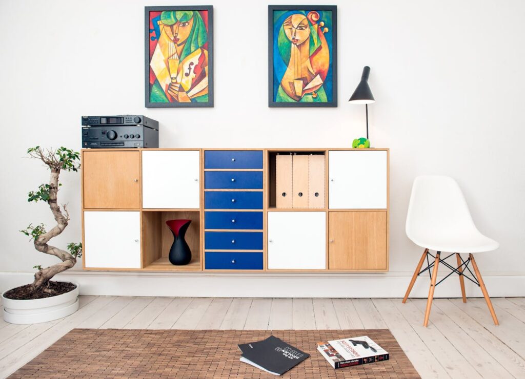
If you’re hesitant about bold hues, start with smaller accents like throw pillows, artwork, or vases. These items can add pops of color without overwhelming the space and can be easily changed if your preferences evolve.
Test Colors Before Committing
Always test bold paint colors on your walls before committing. Use swatches or paint small sections to see how the color interacts with your lighting and furniture. This ensures you make confident choices that enhance your space.
Final Thoughts
Decorating with bold colors is an exciting way to inject personality and energy into your home. By avoiding common mistakes like overloading the space or neglecting lighting, you can create a balanced, stylish interior. Thoughtful planning and strategic use of bold tones will allow you to achieve a vibrant and welcoming design that reflects your unique style.